Photo Walk: Tanjong Pagar Plaza
I was depressed two Saturdays ago about my DJ classes ending, so I distracted myself from that by revisiting an older hobby – photography. The DJ school is near Tanjong Pagar Plaza, an old public housing building with lots of activity in its communal spaces on a Saturday afternoon, so I went on a little photography expedition there. I generally prefer blog entries with a few well-chosen photos rather than a slagheap of mediocre ones, but at the moment part of trying to get myself back into the photography habit is to be a bit less of a damn perfectionist. (Essentially, I accumulate photos, but procrastinate on processing them or printing them because I make the excuse that they’re still not quite good enough.) So here goes, a bunch of passable but not outstanding photos, which are hopefully still better than posting nothing!
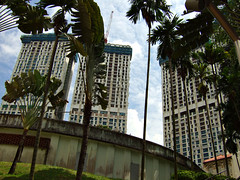
This was taken hurriedly on the way to class so it doesn’t have the best composition, but I still like its odd collection of elements – outer shell of the disused Yan Kit Road swimming complex in the foreground, beautiful old shophouse in the bottom right and the towering half-constructed Pinnacle@Duxton blocks in the background.
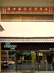
The first two floors of Tanjong Pagar Plaza are a mix of little shops, some self-consciously modern and others which look as if they haven’t changed in twenty years.
I just totally loved that illustration on the sign.
The shops enclose a tiled quadrangle full of benches and greenery. Everyone’s down here on a Saturday afternoon, anxious crowds spilling out of the Singapore Pools betting outlet, cooks washing vegetables in huge plastic tubs, middle-aged men shooting the breeze, and one sweaty photographer trying to be as unobtrusive as she can.
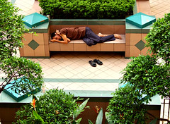
In another country I might refrain from this photograph for fear of exploiting the image of a homeless person. But in Singapore, I’m pretty sure he just decided the shaded bench was cooler for napping than the inside of his flat.
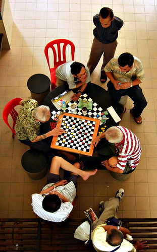
Time for a quick poll! Which of the following two photos of the old men playing chess do you prefer, and why? I couldn’t decide, so asked my colleagues and got different, thoughtful answers about each photo. I’d be interested in hearing your views too.
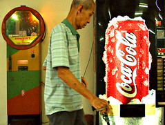
This was a quick snap in very dim lighting so it’s not very sharp and could be better composed, but I processed and posted it to remind myself of what is possible with the Fuji F31fd’s amazing low light capability. If I were using my other camera (the Canon A650IS, also beloved but for different reasons), I’m pretty sure it wouldn’t even be usable.
I had fun taking these photos! Gotta do it more often.

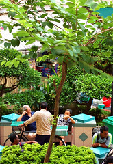
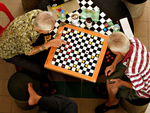
re: the two men playing chess – i like the first one! closer crop, more intimate. also the angles of the men against the table; of the checks on the board against the checks on the table.
plus i like the random crossed leg at the bottom of the frame :)
I prefer the first photo as it’s more intimate and conveys a certain intensity about the two men’s thought processes (if that’s the right way of putting it… you get what I mean, I hope!).
And they’re playing checkers, not chess. Apologies for being pedantic, but chess was my life for six years after all…
Great shots – all of them!
I like the 2nd pic because of the epic story it’s telling,
the business man dressed in comfortable formality (at the top of the picture)watches at a remove, carefull not to disturb his customers, who he recognises but doesn’t “know”
two spectators watch, the note-taker has seen a decisive triple jump in the offing, his companion closes his water bottle, he will soon have to concentrate on his own game.
the two elderly gamers relish the opportunity to communicate as they did as youngsters, when they first learnt to play, when they had everything in common
Alec appears to be sitting crosslegged at the table?
while a gentleman kills time on his way back with the shopping, the magazine wasn’t as good at the glossing covershots made it look, but now the game is heating up.
w and Dominique, I definitely see what you prefer in the first photo. The random crossed leg amused me too, and Dom, I sure feel pretty stupid now that I didn’t realize it wasn’t chess. (BTW, I mean Chinese not English chess. In my defence they’d definitely been playing Chinese chess earlier when I first stalked them from above, but then they took a kopi break so I went off to photograph other stuff. When they returned, I must’ve been too focused on capturing the left uncle’s tattooed arm to notice the characteristic checkers arrangement.)
But blh’s wonderful take on the second shot is a great description of why I’ve found myself preferring it, having had a few days to think about both photos, except that he’s breathed life into the photo far better than I could have. (The cross-legged man isn’t Alec, though I daresay he’d love to while away his Saturday afternoons with old men like this if he could only speak Chinese.)
The reason I asked for people’s views on those 2 photos is that I’ve been worrying lately that my composition has become a bit formulaic, in that I automatically follow the well-known “rules” eg. rule of thirds, get closer in etc., but I wonder if sometimes this results in me missing a more creative way of seeing the shot. With these 2 photos, I think the first shot ticks the right rule boxes but ultimately prefer how the second shot captures more of the community vibe around the chess table.
I really appreciate everyone’s responses though, and am still interested in any other views!
I thought the second one was better and blh’s comments just made me like it even more. Other than the “epic story” and concentration of the players and bystanders, I really like the interplay of patterns and colors in the photo, which when seen from above mashes into a pleasing whole. (It looks discordant in the first photo). The squares of the floor tiles contrasting with the straight horizontal lines of the bench, but also reflecting the square of the checkerboard. The shadow from the pillar.
Yi-Ling: Yes, I agree that the patterns and colors feel discordant in the first photo. Unfortunately the very close crop doesn’t help with that at all, but it can’t be cropped differently without incorporating lots of other messifying elements.
I like your observation about the squares of the floor tiles and the shadow from the pillar in the second photo – I totally didn’t think about that at all!
Thanks for the thoughtful responses, everyone. It’s so interesting to learn about how someone else looks at a photo, and you’ve all highlighted lots of stuff I just didn’t see on my own.